articles
the correct colour
Photographs of nature subjects quite often have colour shift towards one of the primary tones — yellow, blue, green, red, magenta, cyan. As I pointed out in my other article on colour in nature photography ("Colour Madness"), the colour perception is a result of three factors working together: the light source, the object, and the observer. Since our subjects have natural colours and so is usually the colour of the light (even if it is emitted by a flashgun), it is the observer — the camera or the photographer — that we have to blame when the overall colour tone of the captured image appears incorrect. In general, the imperfection of colour and light measurement in our current cameras is certainly the cause. There are at least three situations when a colour shift may occur due to a light measurement error. First, it can be the mixed light from natural and artificial light sources that misleads the camera electronics. In that case the image may show a yellow colour cast like in the first example below. Second, the problem may be caused by the light altered by the environment in some way. For example, the photographed scenery may contain objects or surfaces (such as soil or rocks) that have a certain colour and are reflecting the light. Also there may be objects, such as foliage, that are diffusing and filtering the light. In all such cases the colour of the light falling on the photographed object may be significantly changed. In yet other, third, case, the photographed object itself, like in our second example discussed below, can be absorbing or reflecting parts of the light, and therefore have a different colour in a captured image than in real life.
Last but not least, the photographer himself is a potential error source. It is well known that most people like warm colours. Thus we often push the hues in our images towards more yellow, red and magenta to make them look pleasant. When the colour is, in our opinion, too warm, we do the opposite — increase the amount of blue, cyan or green tones. All such adjustments are subjective, i.e. we do them according to our taste and personal preference. In both cases it is very easy to overdo the adjustments. But probably most important subjective factor is our perception of colour when we are processing an image. It is influenced not only by technical characteristics and quality of our computer system and display but also by our own physical and psychological state. Therefore, having done the postprocessing work on one day, we are satisfied with the results but when we will be looking at that image days or weeks later its colour tone may appear us yellowish, bluish, greenish...
the white balance
"White" is the result of absence of any colour while all three primary colours — red, green and blue — combined will produce "black". Thus, white and black aren't colours at all even though people usually call them so.
Since, in real world, red, green and blue don't mix to 100%, there are no such things as "absolute white" and "absolute black", i.e. snow will never be white, and coal will never be black. The purity of white is commonly referred to as so-called "white balance" (WB). More scientifically, it is described through colour temperature that is measured in Kelvin (K). For instance, the common colour temperature setting for a monitor is 6500K which results in slightly warmer colours. A much less common colour temperature for computer screens is 5000K which leads to colder colour tones. An image that was processed on a screen with 6500K will, of course, show a colour shift towards green or blue on a target display that has a lower colour temperature. For human eyes, the higher the Kelvin value the more the colour in the images shifts towards red, magenta and yellow. With the decrease of the Kelvin value, the colour gets more green, cyan, or blue.
In camera and RAW processing computer software, the WB can be set to a preferred value. In cameras, we can also choose automatic selection of colour temperature according to the current light source. I prefer to set white balance according to main lighting of the scenery, i.e. the WB in my cameras is set to "Daylight", "Shade", etc. Sometimes I use "Auto" setting, however, if I know that the lighting may change, and I may not have time to change the settings in my camera. When such an image file is opened in a RAW processor, colour correction will be done automatically according to the WB value it was tagged with by the camera. While white balance in image capturing and display devices corresponds to a real-life colour temperature, in a software like Capture One, Adobe Lightroom, or Apple Aperture, it is nothing but a metaphor that should facilitate the colour correction work allowing the user to do the adjustments of all colour values with only one selector. What those controls do, is just altering all colour values together making the colour of the image appear "warmer" or "colder". In Adobe Camera Raw or Lightroom, the values in Kelvin that the WB control shows aren't absolute but relative to the current state of the image colour, i.e. if the colour already appears much warmer than it should be, the values will be still as if it were correct.
Since, both the equipment and the photographer can make mistakes in colour adjustments, the colour temperature in an unprocessed image will require some correction in most cases. In the next sections of this article, I am going to describe three approaches to this.
automatic adjustment
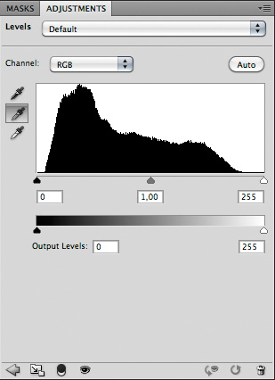
To get the colour of an image adjusted automatically according to a grey target, use the eyedropper tool in the middle.
The best way to achieve a correct white balance is to photograph a reference and apply automatic adjustments in processing software according to it. Such reference targets are a so-called "grey card" or a cube with white, grey and black sides. Just place it somewhere in the photographed scenery and make a reference shot prior or after the shooting of the same scenery without this object. In the image processing software, the white balance in all images from the series can be automatically adjusted in a few seconds according to that one — that has a reference target. To do this, for instance, in Photoshop, open the reference image first. Open the Levels tool (press Ctrl. + L, or Command + L on your keyboard, or choose Image -> Adjustments -> Levels from the main menu) or create a Levels adjustment layer. Select the grey one from the three eyedroppers that you see near the histogram like showed in the picture on the right. Find your reference target in the image. If it was (like mine) a grey card, click on it with the eyedropper. If it was a cube, click on its grey side. The colour of your image will get automatically adjusted to correct. Then choose from the menu of the level adjustment tool Save Preset and save the current histogram state as a new preset. Now, close the reference image and open the image whose colour you want to adjust. Apply the saved preset to it by choosing it from the presets list. That's all.
Obviously, this method of colour adjustment is suitable only for photos of static subjects, such as landscapes or flora. An animal won't wait till you have put your grey card at it and made a reference shot. However, it is possible to apply automatic adjustment with images of animals if in the scenery you captured a neutral grey object, e.g. a stone, happened to be that can serve as reference.
subjective method
Certainly, the least precise and efficient, but, at the same time, most frequently used approach is adjusting colours according to photographer's own perception. This can provide good results when a colour cast is unmistakable.
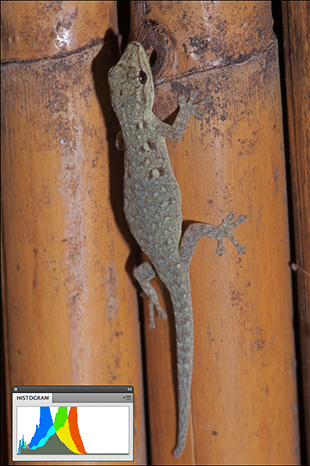
I found the forest gecko showed in the next pictures on the bamboo ceiling of a tree house at Male Simpay Hot Spring in Semuliki Forest near the Congo-Uganda border. It was dark inside, and I used a flash. Either because of that camera and flash combination or for some other technical reason I was getting many images with yellow colour cast i.e. the WB measurement in camera was actually never working properly in lighting situations like this.
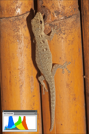 Original unprocessed image captured with 5650K. The yellow colour cast is here very distinctive. |
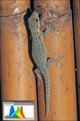 Here the colour has been corrected manually through colour balance adjustment in Photoshop. |
 Here you see the result of manual colour correction through hue and saturation adjustment in Photoshop |
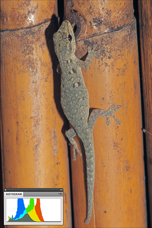
 The white balance adjustment has been set to 4000K in Adobe Lightroom. |
It is obvious that the original image has a yellow colour cast. Even if someone is unsure which is the natural colour of this gecko, it is quite well distinguishable that yellow dominates all over the image as if it was photographed through a yellow filter.
What probably every one would do here — anyway what I would do — is to use one of several colour adjustment possibilities in a RAW converter or image editing software. In Adobe Camera Raw, Lightroom, Apple Aperture, Capture One there is the already mentioned WB adjustment tool with what you can fix this using only one slider. The last image in the above examples is the result of the adjustments I did in Adobe Lightroom.
In image editing programmes like Photoshop, there are several alternative ways to do the same. Purists will probably do it with the gradation curve or levels adjustment. An easier and more convenient way is to use the colour balance or the hue and saturation adjustment tool. In Photoshop, I prefer the first. With both tools, it is very easy to adjust the amount of primary colours in the image — red, green, blue, magenta, cyan, yellow.
Such manual adjustments don't take much time and can be done within the normal image processing workflow — along with exposure correction, saturation adjustment, etc. All work is, of course, only visually controlled, i.e. you push the controls till the image starts looking fine to you. It has that advantage that you have all control over the colour of the image. A big downside is that it is extremely subjective, i.e. it is very likely that the colour won't appear absolutely correct even to you, I you would look at the image couple of days or even hours later — after you have finished the processing work. Although this is my most frequently used method of colour correction, I am never convinced by the result I get with it.
objective method
In some images, the colour shift can't be noticed that easy, when they are unprocessed. If all on-board colour adjustments are turned off, like in my camera, the colour of the original image is desaturated. I adjust saturation during postprocessing.
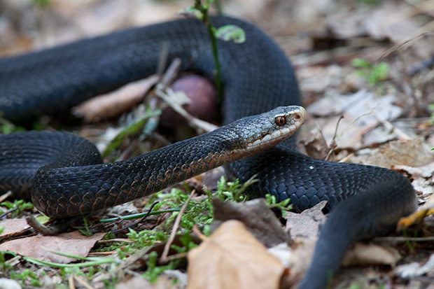
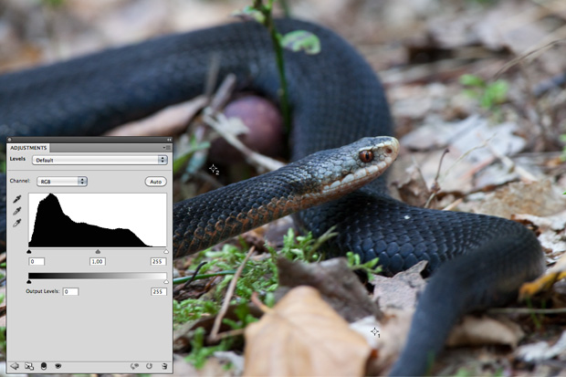
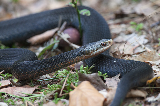
The following picture shows an image as shot — without any adjustments and changes. The snake is looking even on this untouched image quite nice: There are not many improvements needed — a little sharpening, if any at all, would be just enough. However, the moss that should be green appears too pale. In any image like this, I would normally increase saturation or vibrance a little. But it I would do it here, the colour of the snake will be altered, too: It will get some blue cast. At first, it may be not so obvious but if you try to increase saturation you would see that the black of snake's body is getting bluish. You can see it if you place the mouse cursor on the image below.
Here is an image as shot. If you place the mouse cursor over it, a copy of it with saturation increased will show. On that processed image, the body of the snake is looking dark blue instead of black.
I am not sure that all cameras are so, but my Canon camera that I captured this image with had that tendency to record black as dark blue. In images like this, where black is dominating in the main subject, this issue has to be taken serious. To get it fixed, I either use the colour balance tool in Photoshop or the method described below that is more accurate and provides better results.
First you need to know if any would get exaggerated when you increase saturation. Just to do it and to look will not always work because it is quite easy to overlook the colour shift — particularly, if your screen isn't properly calibrated, lacks contrast or colour saturation. Although my display is quite good this happened to me sometimes: I noticed that something is wrong with black in my images only after someone told me how blue was it. Soon I got used to check the colour in images of black animals.
The simplest but a quite rough method is just to push the saturation slider to the right end. As you can see in the next picture, the body of the adder becomes blue when I do that.
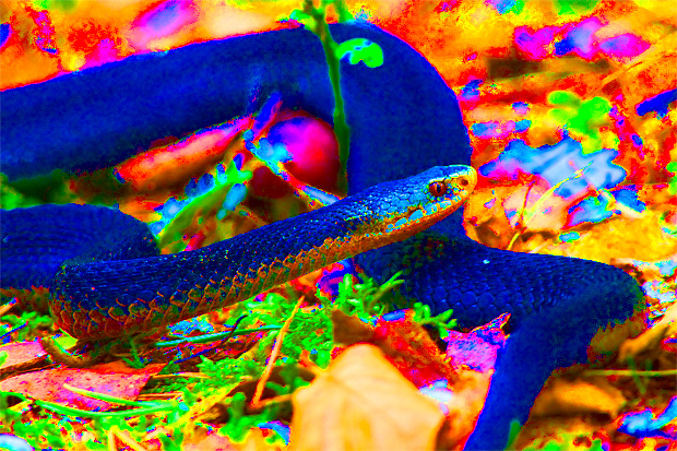
The easiest way to determine which colour in the image will change to which is to push the slider of the saturation control to the right end. Here you see that the body of the snake will then become blue.
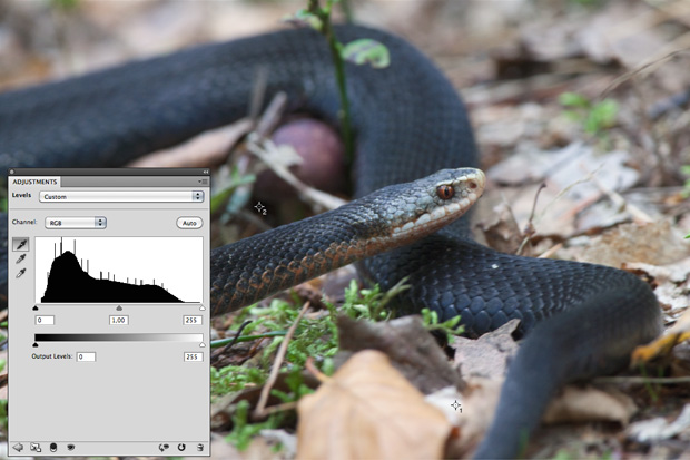
A more intelligent way to do the same is to place the mouse pointer on the area in question and to look at the numbers displayed on the information panel. In Photoshop it looks like showed in the next picture.
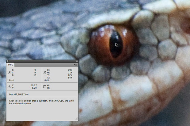
Since I was interested in colour shift of black, I had chosen a point on the image that I expected to bee the darkest — the pupil of snake's eye.
In our example, when I was putting the cursor on the pupil of snake's eye that I expected to be the darkest point in the whole image, I saw that the blue value was significantly greater than red and green.
Although both methods help us to determine which colour will dominate in which area of the image, they don't say anything about the point when it will happen. In this example, for instance, we don't know if the body of the snake will start looking blue before the moss gets green or after. The only possibility that remains us, is to fix the colours in advance — to prevent any colour shift. If you can't yet recognize colour shift, adjusting colours visually — with colour balance or other tools — won't be the best approach here. Much better is to let software to do the job.
First you need to find the darkest and the lightest point in the image. To start, create a Threshold layer as showed in the picture below.
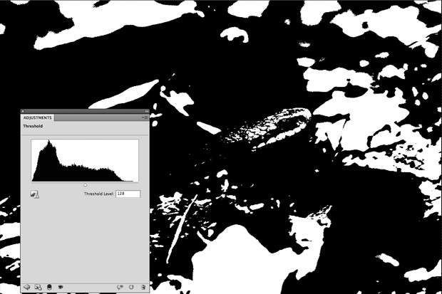
To find the darkest and the lightest spots, we use a threshold layer.
Move the slider under the histogram to the right end: The whole image will become completely black. Then start slowly moving the slider to the left and stop immediately when you see the first white point appear. Select Color Sampler tool ( ) and set its sample size to "3 x 3 Average". Zoom into a white spot on the image and click on it with the tool. A marker will appear on it as showed in the next picture.
Now, move the slider under the histogram to the left end. All black spots will disappear, and the image will become completely white. Move the slider slowly back to the right till the first black spots appear. Carefully select one of them with the Color Sampler. Another marker — with the number 2 — will be set. (You can see how it looks in the picture below if you place the mouse cursor over it.)
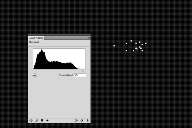
The pictures here (you see another one if you put the cursor over it) show how we find the lightest and the darkest areas in the image and mark them.
Now, you can remove the threshold layer. The markers will remain after that. (See the picture below.)
After the threshold layer was removed the image will be looking like this: The Color Sampler markers will be remaining.
For the next step, create a Levels adjustment layer. Select the white eyedropper — the lowest one — and click with it on the first marker (#1) as exactly as possible. Then select the black eyedropper — the topmost — and click on the second marker (#2). The colour of the picture will be adjusted after that. The result of the adjustment in my example can be seen in the next picture.
This picture shows the result of the automatic colour adjustment with the Levels tool.
Some authors of books about Photoshop (especially, Americans) are recommending to set the white eyedropper RGB value to "244, 244, 244" and the value of the black eyedropper to "10,10,10" before you click on the markers. Personally, I prefer pure white to warm white and pure black to lighter black. So I keep the default settings: "255,255,255" and "0,0,0".
After the colour correction work was done, you can remove the markers: Click on the button Clear on the Colour Sampler toolbar.
In the picture below, you can compare the original image with the adjusted: Place the mouse cursor on the picture to view the original. As you can see, after correction, all colours in the image look warmer, i.e. the amount of blue is reduced.
Here, you can compare the unprocessed original image with one after automatic correction. (To view unprocessed image, place the cursor over the picture.)
Now, it's time for the rest of postprocessing work. We can increase saturation safely: No colour cast will emerge. Below you see the corrected adder photo after I pushed up saturation and vibrance. If you place the cursor over the picture, you'll see how the image would be looking if I would just increase saturation and vibrance not having taken any colour correction measures. In both images, the amount of saturation and vibrance adjustment is roughly the same, but you see how much more blue the uncorrected image is while the green of the moss has similar intensity in both images.
In this picture, you can compare the result of the correction with the original after about the same amount of colour saturation was applied to both. Blue colour cast is clearly visible in the original.
final remarks
For colour correction in my early images, years ago, I was using only the subjective approach: I did it in Photoshop — with colour balance or hue/saturation tool. Quite often I wasn't satisfied with the results but found the automatic colour cast removal demanding too much effort and therefore never used it. Now, I completely changed my mind. Of course, in the snake photo showed above the colour can be corrected buy manual adjustments. The result may appear satisfying first, but when I will be looking at the image some time later, I won't be that convinced, i.e. the colour may appear to me wrong. When I know that the colour is objectively correct, even if there would be moments when it will appear to me not so, I will know that it is due to my own colour perception which may be influenced by surrounding light, other colour objects in the view field, etc. Thus, today, even if I wouldn't do it with every image, I prefer automatic colour correction at least in cases when I feel that some colour in an image may be a problem.
For landscape photos, a grey card should be used whenever possible, i.e. actually, whenever you have the card in the field. It is easy to forget it at home, or not to thing about it in the field — when your attention is concentrated on the shooting rather than on postprocessing. This is what often happens to me, and only for this reason, I don't use automatic correction with grey card as often as it makes sense.