articles
colour madness
As most nature photographers, I capture, process and present images in colour. Certainly, there is no other area of photography where preserving and displaying realistic colours plays more important part than in nature photography. Black-and-white images are much less common here because a nature photographer usually tries to show the beautiful reality rather than to express something — and the reality he captures is always in colour. All the way — from shooting a photo over image processing to printing — we are impressed by colours and are doing our best to bring them to our audience. And yet, as much as we love colours, nothing can frustrate us as easily as when they don't match or appear in the output not as we expected.
Even though colour management in digital imaging may appear complicated to many people, it is pretty straightforward, and one can with very little effort achieve with it good results in a printing workflow. However, the colour presentation in digital media has always been and remains an issue that photographers and artists are struggling with. Like in printing, it is the content author who has to care for consistent colour display across various presentation media. Unfortunately, as long as software and devices aren't doing it themselves consistently and automatically, it is hardly possible to achieve here such level of colour confidence as with images that are presented on paper.
In fact, we should never expect that the appearance of colours in our image on the screen of the viewer will perfectly match the colours that we were seeing on our screen while we were processing the image and preparing it for publication. Unlike with prints, when we are presenting an image digitally, we typically aren't providing the viewer with the medium but are using his own. There is a huge variety of digital devices, with very different display technology and quality. If the viewing audience isn't restricted — which is a typical case — it is impossible to anticipate what viewing devices will be used by viewers. Of course, I always knew this, but since I see my images much more often on the screens of my own computers, I get used to a certain appearance of colours which I perceive as "perfect". Although I like to print photos, the majority of them is published in the Internet. Every time, when I have a chance to look at them on someone else's screen, I am noticing at least minor differences. Very often my frustration is so huge, that I am attempting to adjust the colours in images to make them look better, but it never works: I just loose my time and get more and more frustrated and angry. It is so easy to forget the simple fact: the colours will never look the same on all screens. When I was preparing this website first time for publication I stumbled again upon this issue. The result of two days of unsuccessful experiments with various browsers, operating systems and computer screens was this article where I am going to report my observations and conclusions.
 An image as it appears in Adobe Photoshop on my calibrated screen when the working profile — ProPhoto RGB — is matched to display colour profile. This is how I was seeing the colours on my screen and how I planned them to appear to the viewer. (Note: You may see the colours wrong already here if your monitor displays them not exactly as mine.)
Please, look at the following pictures first. (Click on them to enlarge.) They show how one of my images is rendered by different browsers. (You can find the whole image here Flora -> Digitalis purpurea.) Unfortunately, it is difficult to discuss colours with someone who sees them differently, and I am sure that you don't see the same colours on your screen as I. However, if your monitor is good and your system is configured properly, they will be looking on your screen very similar to how they appear on mine. In that case, we can proceed with the discussion.
2
 Here is how the image looks on my calibrated Apple Cinema 23" display in Apple Safari under Mac OS X (10.6) when the sRGB profile is embedded. On my screen, the colours here are almost identical with the Photoshop image showed in example (1). Here is how the image looks on my calibrated Apple Cinema 23" display in Apple Safari under Mac OS X (10.6) when the sRGB profile is embedded. On my screen, the colours here are almost identical with the Photoshop image showed in example (1). |
3
 Here is how the same image in the same operating system version (Mac OS 10.6) in the same browser (Apple Safari) and also with sRGB profile embedded — but on a different computer with Apple Cinema too (however, 20") but differently calibrated. You may already notice a little colour shift — particularly in saturation. Here is how the same image in the same operating system version (Mac OS 10.6) in the same browser (Apple Safari) and also with sRGB profile embedded — but on a different computer with Apple Cinema too (however, 20") but differently calibrated. You may already notice a little colour shift — particularly in saturation. |
4
 This is the same image, but I haven't embeded any ICC profile. Everything else is as in the example (2): calibrated Apple Cinema 23" display, Apple Safari, Mac OS X (10.6). The image appears with very much desaturated colour. This is the same image, but I haven't embeded any ICC profile. Everything else is as in the example (2): calibrated Apple Cinema 23" display, Apple Safari, Mac OS X (10.6). The image appears with very much desaturated colour. |
5
 Here is an example in Apple Safari in Windows XP. The sRGB profile was embedded but the operating system didn't support colour management. The image is looking very much like in example (3) but with a little more contrast. Here is an example in Apple Safari in Windows XP. The sRGB profile was embedded but the operating system didn't support colour management. The image is looking very much like in example (3) but with a little more contrast. |
6
 The image with no ICC profile displayed in Mozilla Firefox (3.6) under Mac OS X at calibrated Apple Cinema 23". Though the colour management was activated in the browser, the colours are looking desaturated. The image with no ICC profile displayed in Mozilla Firefox (3.6) under Mac OS X at calibrated Apple Cinema 23". Though the colour management was activated in the browser, the colours are looking desaturated. |
7
 The same hardware and software setup as in example (6) but the image is tagged with sRGB profile. The colours don't look the same as in Photoshop and in Safari (see example (1)) but better than when the ICC profile is missing. The same hardware and software setup as in example (6) but the image is tagged with sRGB profile. The colours don't look the same as in Photoshop and in Safari (see example (1)) but better than when the ICC profile is missing. |
8
 Here is the image displayed on Apple Cinema 20" screen in Mozilla Firefox (3.6) under Windows XP. Though colour management was activated in Firefox, it appears not to grant it, or it is because there is no system-wide colour management in Windows XP. However, the colours are looking here a little better than in Firefox under Mac OS X when no image profile is embedded — please, compare this with example (6). Here is the image displayed on Apple Cinema 20" screen in Mozilla Firefox (3.6) under Windows XP. Though colour management was activated in Firefox, it appears not to grant it, or it is because there is no system-wide colour management in Windows XP. However, the colours are looking here a little better than in Firefox under Mac OS X when no image profile is embedded — please, compare this with example (6). |
9
 Camino is "Firefox lite" under Mac OS, so no surprise that it would render colours in a similar way as Firefox — if an ICC profile is provided. Here the image was tagged with sRGB. Compare this example with (7). Camino is "Firefox lite" under Mac OS, so no surprise that it would render colours in a similar way as Firefox — if an ICC profile is provided. Here the image was tagged with sRGB. Compare this example with (7). |
10
 Here is how Google Chrome under Mac OS X displays an untagged image, i.e. that contains no ICC profile. Here is how Google Chrome under Mac OS X displays an untagged image, i.e. that contains no ICC profile. |
11
 And here is the image with sRGB profile in Google Chrome Mac OS X. The rest of hardware and software setup is the same as in example (2). You may notice that this browser performs under Mac OS much like Firefox. And here is the image with sRGB profile in Google Chrome Mac OS X. The rest of hardware and software setup is the same as in example (2). You may notice that this browser performs under Mac OS much like Firefox. |
12
 Opera has no colour management. This example shows how an image with embedded sRGB profile is looking in this browser under Mac OS X: the colours are as if there is no ICC profile. This is because Opera in Mac OS X seems to default to monitor profile but in Windows it will be sRGB, and the colours may appear better there, i.e. as in Internet Explorer showed in the next example. Opera has no colour management. This example shows how an image with embedded sRGB profile is looking in this browser under Mac OS X: the colours are as if there is no ICC profile. This is because Opera in Mac OS X seems to default to monitor profile but in Windows it will be sRGB, and the colours may appear better there, i.e. as in Internet Explorer showed in the next example. |
13
 Internet Explorer (here is version 8) renders colours that are not bad even if no colour profile is included into the image file. This browser doesn't support colour management and ignores any provided ICC profile defaulting to sRGB. Internet Explorer (here is version 8) renders colours that are not bad even if no colour profile is included into the image file. This browser doesn't support colour management and ignores any provided ICC profile defaulting to sRGB. |
the digital colour
A colour in general is defined by three attributes: hue, saturation and brightness. Hue is the dominant wavelength of light in a particular colour. It is what we actually call colour — red, yellow, green, etc. Saturation describes the purity of the particular colour. Brightness (sometimes also called "luminance") is the quantity of light emitted or reflected from a certain object. Together these three parameters allow us to describe a colour in general. They form a basic colour model called HSB. Physics explains the colour that an object has as the result of combination of light with different wavelengths that it emits or absorbs. In real world, however, the perceived colour is the product of three factors: the illuminant which is the light source, the object which reflects and absorbs the light, and the observer — a human, a photo camera, etc. How the colour appears depends on all these three factors combined.
To work with digital colour, we need a way to describe all three components of that real-world HSB model. The brightness is described by a numerical value referred to as gamma which indicates the relationship between different levels of brightness that a digital device can display. For hue, either device-independent or device-dependent colour models are used. Device-independent models describe the colour as we perceive it, i.e. most closely to reality. The best known such model is LAB (aka Lab, or L*a*b) which describes the colour as it is perceived by humans in real-world conditions. This is the reference model in any colour management. Device-dependent models describe the colour as it is produced or processed by technical systems. Among two such models — RGB and CMYK, the first one is the most preferred for digital imaging today because it describes emitted light, i.e. the colours we are seeing on a computer or TV screen. Thus for a photographer it is usually enough to know only about these two colour models — LAB and RGB. It is that simple!
LAB is used in so-called colour profiles as reference for device-dependent colour information provided in the RGB model (sometimes it may be CMYK but, for the sake of simplicity, I would omit it in this discussion). The RGB colour values in a profile have no meaning unless a concrete device is producing an output based on them. LAB allows to bind such values to the real-world colour. This is what a colour profile is for. Colour profiles, that are commonly referred to as "ICC profiles", are a major component of any colour management.
colour management for digital images

2

3
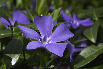
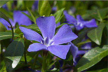
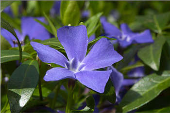
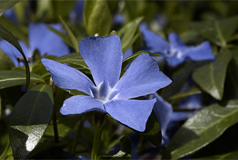
 If you live in Europe, you may know this plant: It is lesser periwinkle (Vinca minor) which is very common in European forests and gardens. Image 1 shows the more or less correct colour of the flower: it is blue with some magenta. Depending on lighting, it may look sometimes as in image 2, but never as in image 3. In the images 2 and 3, I pushed the Hue slider by +/- 5 relative to the value in image 1. Every one who knows this plant would say that the flower in image 3 is looking odd — just because of this 5% colour shift. (I have embedded the sRGB profile in these examples, so I hope you will see on your screen what I mean.)
Colour management provides means to ensure that the digital imaging workflow would produce the output with predictable colour. If you print your images, you will be certainly familiar with colour management because it is the only way to make the colours of an image on paper match those that you see on your computer screen. Many photographers who present their work only digitally — in the Internet — have no interest in colour management because they believe that either the colour shift in images displayed on different screens would be not significant or that they can't do anything against it anyway. If you are satisfied with the colours your images have on other people's screens or just don't care about it, this attitude could be justifiable. In nature photography, however, the correct colour may be critical for some subjects. Just think about the cases when an insect or a flower has a clearly distinguishable colour that is typical for this species. Even a minor shift of such colour will be noticable and may spoil the overall look of the subject. It is very easy, for instance, to let a warm blue colour of a flower look a little more magenta or too much blue. In that case, it may be still possible to distinguish the species but it would be looking odd to all people who know how the colour is in reality. While a little "warmer" or "colder" colour temperature (so-called balance of white) than real could be acceptable or even preferred in human portraits, landscapes, and many other photographic genres, its even very little shift in a flower photo can make it look horrible — as my examples shown on the right demonstrate.
Such hue shift may occur not only due to errors in postprocessing that you have made. As the next examples show, the browser can do it for you if it either can't interpret the colour profile you have tagged your image with or there is no profile.
| The image of periwinkle in Photoshop — with ProPhoto RGB colour profile embedded. Just look how it is displayed by your browser. In browsers that are installed in my system (Mac OS X) and on my screen (Apple Cinema 23" calibrated with custom profile) it appears as showed in the next pictures. |
|
| This is how the image with embedded ProPhoto RGB appears in Safari. |
|
| This is how Chrome renders the same image. It is identical with that in Safari, i.e. both browsers support ProPhoto RGB in Mac OS X. |
|
| And here you see it in Firefox 3. This browser can't interpret the colour profile: it just uses the display profile instead. |
|
| Opera — which isn't "colour aware" at all in any system — also renders it wrong but strangely — a little different than Firefox. |
|
The behaviour of the browser is then quite unpredictable and depends on its type and version. Ideally, it should then render the colour with the default profile that the operating system is providing. In colour-managed operating systems such as Mac OS, it would default to display profile. In that case, the colours will be almost certainly wrong. In newer versions of Windows (after 2006), a system-wide colour management is available, but defaults to sRGB profile if no display profile was applied. This means that embedded profiles should be granted by this system. If you haven't attached a colour profile but your image colour space is sRGB, it will appear correctly. In a non colour-managed system, such as Windows XP, browsers should default to sRGB which may result in correct colour if you have been using this profile during postprocessing or converted the image before publishing but didn't attach the profile. With the appearance of new versions of browsers and operating systems this behaviour may change.
To improve the chances of your image to appear in correct colours to the viewer, I would advice you to establish a colour management workflow and use it consequently for all images even if you don't print them. Surprisingly many people think of colour management as of something complicated. But it isn't so at all. The concept of colour management is very simple and elegant: Every device or software which is participating in imaging workflow processes colour information according to a provided colour profile. Above I have already explained what a colour profile is: It is a file that contains a table where device-specific colour data (the so-called colour space that a particular system needs in order to process colours) are matched to a device-independent colour model, i.e. to the real-world colours. Colour profiles ensure that real-world colour to persist throughout the entire imaging workflow although each of its members has its own interpretation of colour, i.e. within its own colour space. If you didn't provide such information for your image, i.e. didn't attach the colour profile to the file, but converted the colour data before publishing to the colour space that is suitable for the browser, the browser may show colours properly. If the browser doesn't support that particular colour space, it doesn't matter whether you attached the colour profile or not. This is demostrated in the above examples with a periwinkle flower and the ProPhoto RGB colour space. The same may happen with some browsers if you tag your images with the colour space Adobe RGB (1998). Some writers don't recommend it arguing that browsers would render the colours in that case with decreased saturation. This is wrong. Browsers that can process Adobe RGB will display the colour normally. If the colour appears different it means that the particular browser lacks Adobe RGB support. The currently most advanced browsers Apple Safari and Google Chrome are able to render colours in all three colour spaces typically used in digital imaging workflow: sRGB IEC61966-2.1, Adobe RGB (1998), ProPhoto RGB.
|
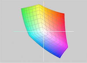
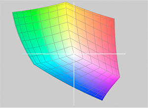
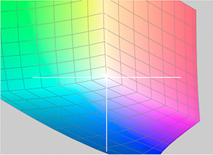
These charts show three colour spaces that are used in digital imaging workflow in comparison to each other. You can see how huge the ProPhoto RGB colour space is compared to sRGB and Adobe RGB. The sRGB that is currently standard colour space in the Internet is the smallest. Please note: All these colour spaces are of the RGB model. Though often confused, a colour space and a colour model isn't the same. A model is just an approach to coding colours for a certain type of device but not the result — which is the colour space. All colours of a given colour space are also referred to as "gamut". Among these three colour spaces, the gamut of sRGB is the narrowest while that of ProPhoto RGB is the widest. |
sRGB IEC61966-2.1
|
Adobe RGB (1998)
|
ProPhoto RGB
|
No browser can convert colours from one colour space to another, and we shouldn't blame browsers for this because image processing isn't their task. To make an image suitable for presentation in a browser, we convert working colour space, i.e. one that we were using for processing the image, to a colour space that browsers can render.
The following table lists the colour profiles used by the participants of my imaging workflow when an image is published online. For print, a printer profile for a specific paper is used.
| Workflow Participant | Colour Profile |
| Photo camera | Adobe RGB (1998) |
| RAW Converter | Adobe RGB (1998) |
| Monitor | custom profile |
| Adobe Photoshop | ProPhoto RGB |
| Web Browser | sRGB IEC61966-2.1 |
The first step is capturing an image with a camera. Both of my current cameras are set to Adobe RGB and 14 bit colour — to get the maximum of real-world colours captured. I store and manage all RAW files with Adobe Lightroom that uses Adobe Camera Raw (ACR) for export into editable formats with working colour profile. The editable format that I use is 16 bit TIFF, and the working profile is ProPhoto RGB. This allows me to edit the images with the widest gamut possible. During RAW conversion, the colour space has to be converted as well. The second time it is converted when the file for online publication is saved with sRGB profile. First the colours are converted from a colour space with narrow gamut to one with a wider gamut. At the last stage, the wide gamut of ProPhoto RGB has to be compressed for the colours to fit into the much narrower of sRGB. The extension or compression of gamut is done with so-called rendering intent — an algorithm defining how the colours are converted. I prefer to use in both cases the perceptual intent which is the best for photographic images. Of course, with compression of gamut much of colour information gets lost. I really hope that all devices and software sooner or later would support ProPhoto RGB at least as an option, so that the conversions wouldn't be necessary any more.
As I already mentioned, I use only calibrated screens, i.e. a customized profile for each screen. Ideally calibration should be done with a colorimeter — for instance, a device that is manufactured by GretagMacbeth, X-Rite or Datacolor. If you have no colorimeter, you can create a profile for your screen visually using a software that comes with your system — for example, Adobe Gamma (in Windows) or Apple ColorSync (in Mac OS). Using a profile provided for your monitor by the manufacturer isn't an alternative for calibration but is better than nothing. Since the perception of colour depends on very many human factors, even if the monitor is calibrated, it is worth to compare now and then the colours rendered by it with a standard colour chart, i.e. X-Rite Color Checker.
The monitor has a much narrower gamut than ProPhoto RGB, i.e. I see only a little part of the colours of my working profile while I am working on an image. Of course, the conversion between ProPhoto RGB and the monitor colour space is done with a rendering intent which is also in this case perceptual. Assuming that some people may use other image editing software than Photoshop I won't describe here the details of the colour management configuration that I use in my case. If you would like to configure the colour management for your postprocessing workflow, you can find the explanation of how to do that in the documentation supplied with you imaging software. Usually these are only a couple of settings that you do in one or two pop-up dialogs.
At the final stage, I convert the image to sRGB IEC61966-2.1 and 8 bit and export it as JPEG with 80% quality. Although I do this, i.e. create a perfectly suitable file for online presentation, the colours of the image would not appear the same ton all viewers.
can there be a solution?
No. The problem that we discussed here is caused by the variety of technical devices being used by people. There is nothing bad in this variety itself, and we should regard it as a completely normal effect of technical progress and competition between hardware and software developers and manufacturers. However, if we can't completely solve the problem of inconsistent colour display, it doesn't mean that we should just give up. The following measures may help us to live with it and to reduce its impact:
1. work with calibrated screens.
Begin with yourself: ensure that the colours that you see and produce in image editing process are correct. The best way to it is to calibrate your computer screen. I work with my images on two computers. Each of them has two displays, i.e. I see my images on 4 screens. Though all of them are of very high quality, I calibrated them immediately after purchase and re-calibrate now and then. I need it because I want my images to look the same on all four screens and want to be certain that their colours are objectively correct, i.e. as much as possible correspond to real-world colours.
Some people believe that it is enough just to work with a good screen. This is only partially true. Of course, a good display is what we always should start with. In my opinion, for work with photos a good monitor is even more important than a powerful computer or software. If you are a photographer, it is wise not to save money with it. You may not buy Adobe Photoshop and use GIMP instead, your computer may be old and slow because you have no budget for an upgrade. In that case you will just need more time to work with your images if the processor is slow or the software is not very sophisticated — but the results will still be good. Things may be completely different when your monitor is a crap. When you work on an image you make it look good on your screen. Making an image match a bad display does not guarantee that it will appear good when the monitor is of top-quality. When first-class monitors cost 2.000 - 4.000 €, you wouldn't do anything wrong if you pay at least 500 - 700 € for a monitor — which will be if not excellent then at least just good. Further discussion of the requirements that a monitor of a photographer has to meet would exceed the scope of this article, so I would not elaborate on them here. The quality and technical features of a monitor correspond roughly to its price, i.e. you can normally expect from a monitor that costs at least 500 € it will be good enough for image processing.
The next step will be to install a colour profile for the monitor. The best way is to create a customized one as we discussed above.
2. persevere the colour managed workflow.
Here I am assuming that the operating system of your computer is either Mac OS or Windows. Other OS, such as Linux, may lack colour management features or support them only partially. If you use Photoshop, configure it properly in the Color Settings dialog. If it is a different image editing software, find out how to setup colour management in it.
3. always publish tagged images.
I've seen advices that photos that are to be published in the Internet shouldn't be provided with colour profiles at all. People who give them are usually arguing that the standardization of browsers goes towards rendering of untagged images with sRGB colour space. Thus there is no need to attach a profile to the image file: it will only increase its size, but the browser will default to sRGB without it and render correct colour. This argumentation is wrong or at least outdated.
The development of browsers and operating systems is going just in opposite direction — towards colour management. It was added to the recent versions of Windows, and to Mozilla Firefox. New browsers — Apple Safari and Google Chrome — are also colour managed, both in Mac OS and Windows. Internet Explorer that lacks colour management is the only browser that works like those writers are suggesting: it displays all images by default with sRGB colour space. But this browser exists only in Windows. Opera that ignores ICC profiles too, defaults to sRGB only in Windows. In Mac OS it uses the current monitor profile, and would render the colours of the same image differently.
4. find a compromise.
Check the images on as many screens as possible and, if the colours somewhere appear bad, adjust them till they will be looking more or less acceptable on all screens you are checking with. Use only good screens: adjusting the images for bad displays is a really bad idea which was already discussed above.
5. be aware of your target group of viewers.
It is neither possible nor necessary that your photographs attract all people on the Earth. Like with printed images that you sell, give or just show concrete persons, only certain audience will interested in your images when they will be published in the Internet or distributed on an optical disc. Well, the Internet audience may be very unpredictable and heterogenous. But occasional visitors of your website are normally not those people whom you as a photographer want to impress with your work. More likely you would want to show your images to other photographers, publishers, or other potential buyers. You can expect that they will be using good screens — often better than yours. In that case I would prepare my images only for this audience. I would then either ignore the technical issues that other viewers may have with my images or restrict their access, i.e. redirect their browsers to a page explaining that the online gallery can be accessed only with specific browsers, screen resolution, etc.
6. don't take it too serious.
Usually the variations in colour rendering between different browsers, operating systems and displays are quite minor, so that most people even won't notice any. This is always only you who exactly knows how the colour should be, hence a colour shift that is obvious to you may not be so to other person. In that case, unless the colours are absolutely horrible, just stay cool and do as if everything is all right.